Costco Website Features Redesign
A redesign of the Costco's website features to enhance the website's usability and accessibility in order to improve the customers' online shopping experience.

Project Description
Costco is the world's largest membership warehouse club and it's famous for its unique warehouse shopping experience. However, their existing website is cluttered and difficult to navigate. As a UX Designer and a regular Costco customer, I decided to take on this project to redesign the Costco website on my own.
The goal of this project is to modernize the look and feel of the website and improve the users' overall online shopping experience.
TIMELINE
October 2022 -
January 2023
MY ROLES
User Researcher
UX Designer
TOOLS
Figma
Miro
Current Website


Design
Process
User
Research
Research Methods
I started with a general idea on "What" the problem is, now I have to understand "Why".
For this project, I chose Engagement Survey, as well as Stakeholder Interviews as my User Research methods. Due to time constraints, the following parameters were applied.
-
Users who have a Costco membership or have shopped at Costco online
-
Male/Female
-
Ontario Wide
-
Age 18-65
With engagement survey, I focused on going wide within the Costco's stakeholder groups to explore needs and surface insights. The survey allowed me to engage with a broad group of individuals and questions would include both close-ended and open-ended approaches to gathering stakeholder feedback. The Engagement Survey was shared with 30 Costco customers in front of the Costco store.
Here are some of the survey questions that I developed:
(Survey developed in SurveyMonkey)
Stakeholder interviews would garner deep insight about different stakeholder experiences. These in-depth interviews offer rich knowledge of the stakeholders' current experience using the website in addition to their insights using other shopping websites was imperative for creating my design later on. I conducted 10 one-on-one interviews for this project.
Here are some of the interview questions that I developed:
-
How does the Costco website make you feel generally?
-
What are your goals for using Costco's website?
-
How do you feel about the search filter on the Costco website?
-
What are the things you see on the Costco Website's homepage?
-
If you would like to purchase an item, what do you do on the Costco website?
-
If you have a magic wand, what would you change the Costco website to make your shopping experience better?
Some of the interview questions were based on Empathy Map - a collaborative visualization used to articulate what we know about a particular type of user.


User Research
Data Analysis & Synthesis
After conducting engagement surveys and stakeholder interviews, the next step of the User Research process is Data Analysis and Synthesis. As a User Experience Designer & Researcher, I analyzed the research data in Miro boards with the following 5 steps:
Step 1: Collect the data.
Step 2: Transcribe the initial insights.
Step 3: Uncover the findings.
Step 4: Uncover the themes.
Step 5: Uncover the insights.

User Research
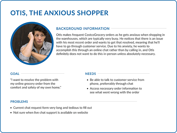
Personas
Based off the insights from the data analysis and synthesis, three personas were developed. These personas, each of which embodied typical user goals and needs, highlighted potential problem areas that allow for improvement in user experience.


Problem Definition
After conducting the User Research methods and further analyzing the User Research data, I've gained valuable insights of the main frustrations users were experiencing while using the website. The main user pain points included:
-
a cluttered homepage
-
inconsistency between items displayed in results
-
difficulty determining the details of certain items
-
tediousness when requesting live chat support
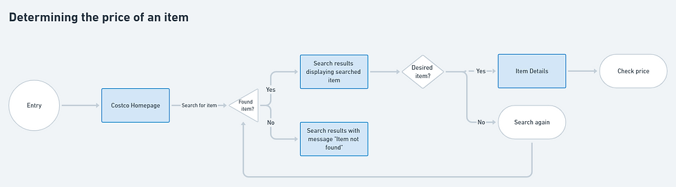
User Flows
I created three user flow diagrams to map out experiences for three common user tasks. These diagrams visually aided in my planning of the redesign, allowing me to better understand what the interface needed to provide the user for a positive usage experience.


Ideation
I started off with some basic sketches to get a better idea of how I wanted to layout the content and information in different screens.

Low-Fidelity Prototyping
Wireframing
I created a set of low-fidelity wireframes with very minimal use of color in order to focus on the user experience. I wanted to make sure to focus on usable design before incorporating visual design elements into my work.

High-Fidelity Prototyping
Final Design
I used Figma to create high-fidelity designs based off of my wireframes. I targeted 4 areas of user frustration while redesigning the website: visual clutter, inconsistency, lack of information, and form fatigue.
.png)
High-Fidelity Prototyping
Problem Focus #1:
Visual Clutter
Users reported that the homepage of Costco website felt like a large ad—filled with visual clutter and lacking organization. The amount of information displayed and delivered to the users was too much too fast. The top row of hyperlinks was also difficult to see as users were more drawn to the main navigation bar.
To alleviate these frustrations, I began by redesigning a new header and navigation bar. I kept the main categories available, and removed the top row of hyperlinks as users don't notice them and don't know what they are. It did not improve the overall shopping process, so I did not feel that it was necessary to include. Since the background is a pure white, I chose a dark gray (#313131) over pure black for the main text as the greater contrast between pure black and pure white could lead to user eye strain.

(Redesigned header and navigation)
I retained Costco's brand colors (#E41F36 and #0061A9) and used the blue as the main accent color within the header. I selected a light gray container to keep the website looking well-lit, mimicking the bright overhead lights in the warehouses. Since the background is a pure white, I chose a dark gray (#313131) over pure black for the main text as the greater contrast between pure black and pure white could lead to user eye strain.
I chose to group what was being displayed into clear cut categories. Ongoing deals and savings are showcased in a banner at the top of the screen, similar to how it is on CostcoGrocery currently. Featured categories can be found right under this banner. These categories can be changed based on seasons, holidays, or other special occasions.
CostcoGrocery also has a different inventory of items available dependent on the delivery method, which include same-day, two-day, and cold and frozen delivery. I placed these categories on the home page so that users can easily browse and shop for items knowing the time frame they will receive their order by.
.png)
(Redesigned homepage)
High-Fidelity Prototyping
Problem Focus #2: Inconsistency
Maintaining consistency amongst search results so that users would be able to easily know what item they were looking at and immediately add it to their cart from the product search results page was something I knew I wanted to provide to users in my redesign.

(Redesigned product search results page)
High-Fidelity Prototyping
Problem Focus #3:
Lack of information
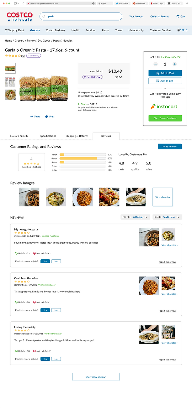
General item information including pricing, product details, and reviews are included on the product page for both known and unknown users.
High-Fidelity Prototyping
Problem Focus #4:
Form fatigue
To simplify the process to connecting to live chat support, I reduced the information requested in the chat form to only the most necessary details. The goal is to get a customer connected to a representative as soon as possible so that they aren't fatigued by the long chat contact form. I included the status of chat support on the right side of the page so that users will easily be able to see when they can reach a representative through chat.

(Chat support screen)
Project Reflection
For this project, I wanted to keep the essence of the current Costco website intact. My focus was to improve the experience of the website rather than designing a completely new interface. I tried to keep the elements of the website that worked well for users while simplifying areas that did not add to the user experience.
I learned to look at design from a different perspective, thinking about what may have influenced the company to make these design decisions. And I realized that one thing we often take for granted when designing for fun or for academic projects, is the privilege of setting constraints aside. When advocating for our design decisions, we can feel as if we have boundless resources, when in reality, it's crucial to remember the very real roles that time and money play in driving design decisions.